The Puddin’ Express
Food Truck Branding Concept — 2019the brief
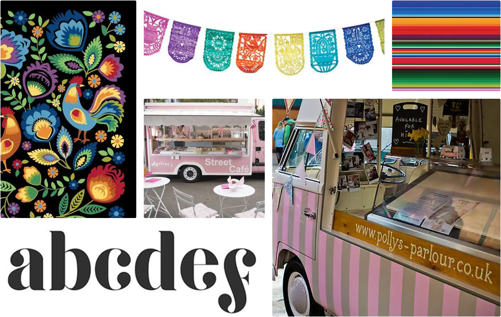
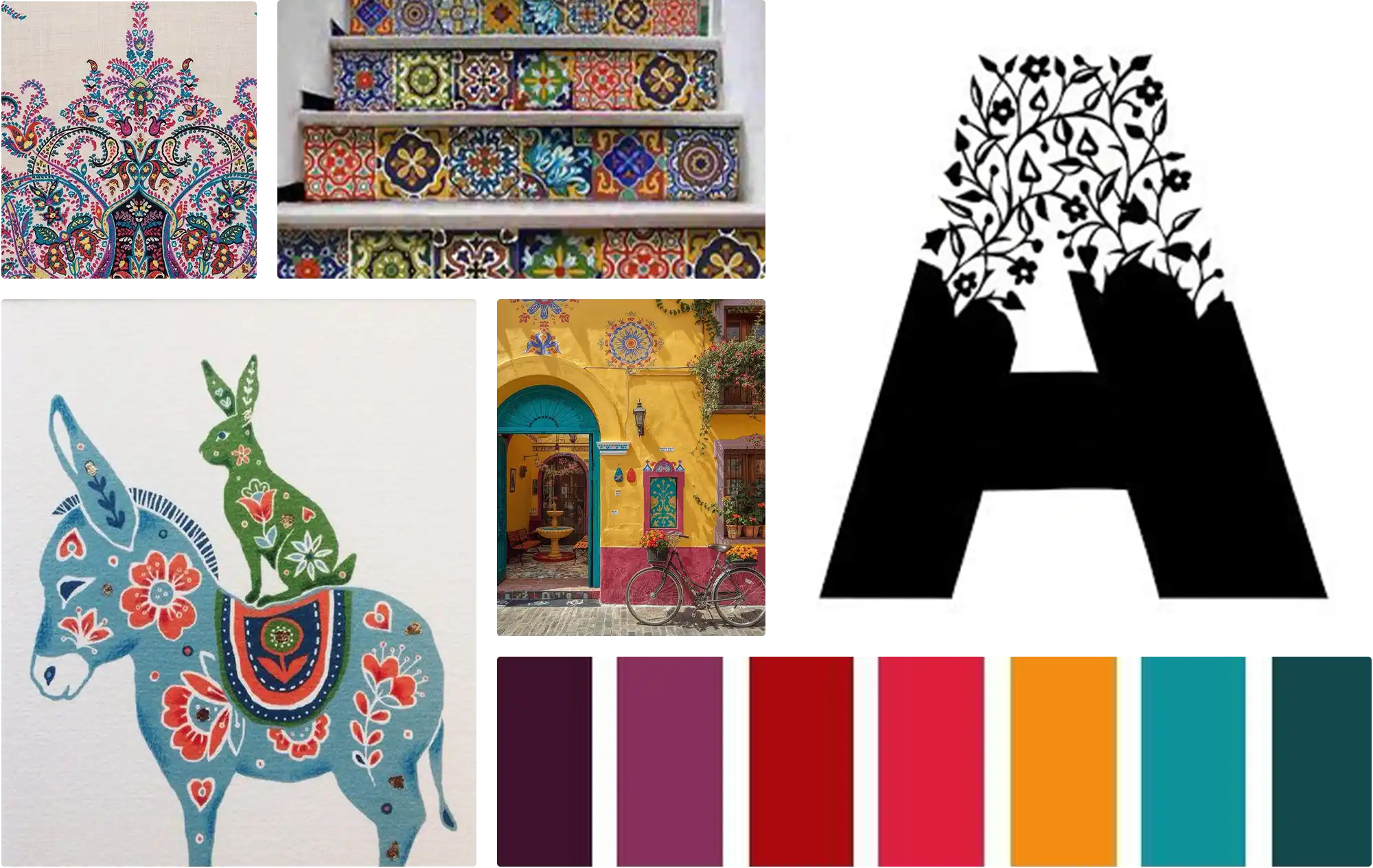
the inspiration
The visual direction drew from the warmth and vibrancy of Mexican folk art and culture — the hand-painted tiles, the papel picado, the bold saturated color of a pueblo in full celebration. The goal was a brand that felt festive but not loud, colorful but not chaotic. Warm enough to feel like home, polished enough to feel intentional.
the exploration
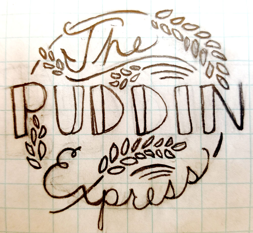
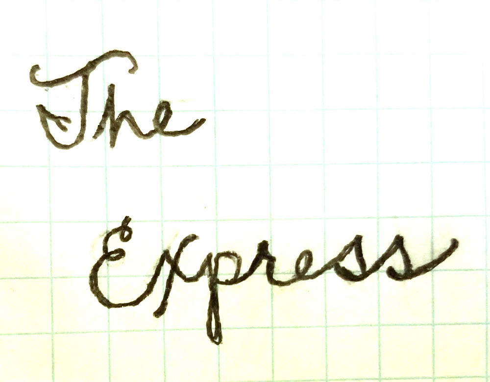
Before any pixels, there was paper. Drawing has always been part of how I think through a design problem — not as illustration, but as a way of working out ideas before committing to the screen. The logo composition — the bold block lettering, the script, the grain motif wrapping the type — was worked out by hand first. What started as a rough sketch became the blueprint for the final mark.
the thinking
Good branding starts with knowing who you're designing for. Two audience personas were developed to ground the visual decisions in real human context — defining not just demographics but personality, lifestyle and values. Meet Daveed and Vida.

Vida is a young professional building her career and getting her name out there. She loves her job at the Old Globe Theatre and enjoys giving her free time to playwriting...
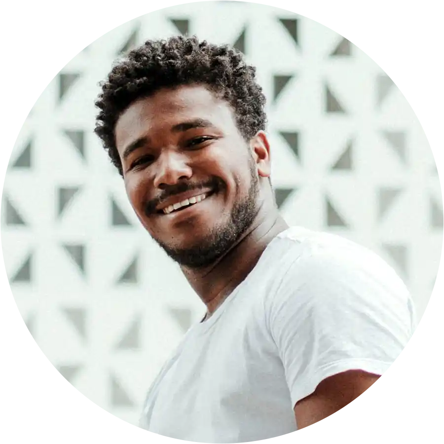
Daveed is a 3rd year college student attending San Deigo State University and majoring in Biology with a minor in Geological Studies. He hopes to be a Biology teacher one day.
the system
Every element of the Puddin’ Express brand was designed to work together as a cohesive whole — from the hand-lettered logo mark to the color palette rooted in the warmth of Mexican folk tradition. The result is a complete brand system built to live consistently across every surface the truck might touch.


the reflection
The Puddin' Express was designed in 2019 but the love behind it hasn't changed. Looking back, the brand system is stronger than I gave it credit for at the time — but so is my eye. There are choices I'd push further today, colors I'd be bolder with, and a visual language I'd let breathe a little wilder. Returning to this project has been a reminder that the research and legwork make the design process cleaner and the result stronger—and that the foundations built before a mark is made are what hold everything together.